Building the Prudential Tower in CSS
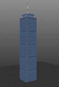
Last week I saw an awesome post by Matteo Spinelli on Building a CSS City and loved the idea. Since I am somewhat obsessed with trying to build things with 3D transforms (even though they are very impractical at this point), I decided to attempt the Prudential Center. The concept was basically the same as his, except instead of building out I am building up.
The tower is built of 4 blocks stacked on top of each other: the spire, hub, neck and floors. Each block is essentially a cube of a certain size positioned using CSS Transforms and skinned with a texture. The proportions of the building are not quite right, but I couldn’t find them anywhere easily enough.
The markup is pretty simple:
<div class="block spire">
    <div class="side1"></div>
    <div class="side2"></div>
    <div class="side3"></div>
    <div class="side4"></div>
    <div class="top"></div>
</div>
<div class="block hub">
    <div class="side1"></div>
    <div class="side2"></div>
    <div class="side3"></div>
    <div class="side4"></div>
    <div class="top"></div>
    <div class="bottom"></div>
</div>
<div class="block neck">
    <div class="side1"></div>
    <div class="side2"></div>
    <div class="side3"></div>
    <div class="side4"></div>
</div>
<div class="block floors">
    <div class="side1"></div>
    <div class="side2"></div>
    <div class="side3"></div>
    <div class="side4"></div>
    <div class="top"></div>
</div>
And CSS for the main section of the building:
.block {
    margin: 0 auto;
    width:100px;
    height:500px;
    -webkit-transform-style:preserve-3d;
}

.block div {
    position:absolute;
    width:100px;
    height:500px;
    background: url('images/pru-side.jpg');
}

.floors .top {
    height: 100px;
}

.side1 {
    -webkit-transform:rotateY(90deg) translate3d(-100px,0,100px);
    -webkit-transform-origin:0 100% 0;
}

.side2 {
    -webkit-transform:rotateY(-90deg);
    -webkit-transform-origin:0 0 0;
}

.side3 {
    -webkit-transform:translate3d(0,0,100px);
}

.side4 {
    -webkit-transform: rotateY(180deg);
}

.top {
    -webkit-transform:rotateX(90deg) ;
    -webkit-transform-origin:100% 0;
}

.bottom {
    -webkit-transform: rotateX(90deg) rotateZ(90deg);
    -webkit-transform-origin:0 100%;
}
The other sections use similar transforms, just with different sizes and offsets to align them in the center. Take a look at the Final Demo in any webkit browser.