There is no way around it, creating data visualizations with D3 is just plain fun. Lately, I have especially enjoyed building map visualizations, but I hadn’t figured out an excuse to use the azimuthal projection on a project.
Continue reading
Solving Problems Subscribing to Facebook Real-time Updates
 Facebook’s Real-time Updates documentation is not very explicit on how to subscribe to a feed, especially when all I am looking for is an example. So after figuring out what
 OAuthException (#15) "This method must be called with an app access_token" was trying to tell me and fixing the problem, I figured I would share my PHP example here. Hopefully, it will be helpful to you.* There are two parts that you need to set up:
Building the Hancock Tower in CSS
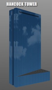
Still feeling inspired by Building a CSS City, I recreated another Boston building using CSS transforms this weekend: the Hancock Tower. This one was a bit tougher than building the Prudential Tower because it is more than just a few different size boxes stacked on top of each other.
Creating the main body of the building wasn’t too hard, except for the inset parts on the thin sides. The base, on the other hand, was a pretty big pain. Fitting the sides together and sizing a top was a bit of a struggle (and probably mostly unnecessary because no one really notices that part of the building), but I think it turned out pretty well. The roof of the base flickers when spinning around the back of the building in Chrome for some reason, but appears perfectly in Safari.
After getting the building shape together I added the glass window texture and the darker row on the top of the building. Also, I think the coolest part of the Hancock Tower is how it reflects whatever is around it, so I added a cloud photo that rotates as the building moves around.
Originally I though there would be way less DOM elements on this model, but it turned out to be around the same as the Prudential Tower because of all the details:
<div class="wrapper">
            <div class="block floors">
                <div class="side1">
                    <div class="inset left"></div>
                    <div class="inset left-center"></div>
                    <div class="inset right-center"></div>
                    <div class="inset right"></div>
                </div>
                <div class="side2">
                    <div class="inset left"></div>
                    <div class="inset left-center"></div>
                    <div class="inset right-center"></div>
                    <div class="inset right"></div>
                </div>
                <div class="side3">
                    <div class="windows"></div>
                </div>
                <div class="side4">
                    <div class="windows"></div>
                </div>
                <div class="top"></div>
            </div>
            <div class="block base">
                <div class="side1">
                    <div class="inset left"></div>
                    <div class="inset left-center"></div>
                    <div class="inset right-center"></div>
                    <div class="inset right"></div>
                </div>
                <div class="side2">
                    <div class="inset left"></div>
                    <div class="inset left-center"></div>
                    <div class="inset right-center"></div>
                    <div class="inset right"></div>
                </div>
                <div class="side3"></div>
                <div class="side4"></div>
                <div class="top"></div>
            </div>
        </div>
Take a look at the Hancock Tower demo in a webkit browser (Safari looks better than Chrome if you have the option).
Building the Prudential Tower in CSS
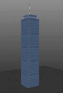
Last week I saw an awesome post by Matteo Spinelli on Building a CSS City and loved the idea. Since I am somewhat obsessed with trying to build things with 3D transforms (even though they are very impractical at this point), I decided to attempt the Prudential Center. The concept was basically the same as his, except instead of building out I am building up.
The tower is built of 4 blocks stacked on top of each other: the spire, hub, neck and floors. Each block is essentially a cube of a certain size positioned using CSS Transforms and skinned with a texture. The proportions of the building are not quite right, but I couldn’t find them anywhere easily enough.
The markup is pretty simple:
<div class="block spire">
    <div class="side1"></div>
    <div class="side2"></div>
    <div class="side3"></div>
    <div class="side4"></div>
    <div class="top"></div>
</div>
<div class="block hub">
    <div class="side1"></div>
    <div class="side2"></div>
    <div class="side3"></div>
    <div class="side4"></div>
    <div class="top"></div>
    <div class="bottom"></div>
</div>
<div class="block neck">
    <div class="side1"></div>
    <div class="side2"></div>
    <div class="side3"></div>
    <div class="side4"></div>
</div>
<div class="block floors">
    <div class="side1"></div>
    <div class="side2"></div>
    <div class="side3"></div>
    <div class="side4"></div>
    <div class="top"></div>
</div>
And CSS for the main section of the building:
.block {
    margin: 0 auto;
    width:100px;
    height:500px;
    -webkit-transform-style:preserve-3d;
}
.block div {
    position:absolute;
    width:100px;
    height:500px;
    background: url('images/pru-side.jpg');
}
.floors .top {
    height: 100px;
}
.side1 {
    -webkit-transform:rotateY(90deg) translate3d(-100px,0,100px);
    -webkit-transform-origin:0 100% 0;
}
.side2 {
    -webkit-transform:rotateY(-90deg);
    -webkit-transform-origin:0 0 0;
}
.side3 {
    -webkit-transform:translate3d(0,0,100px);
}
.side4 {
    -webkit-transform: rotateY(180deg);
}
.top {
    -webkit-transform:rotateX(90deg) ;
    -webkit-transform-origin:100% 0;
}
.bottom {
    -webkit-transform: rotateX(90deg) rotateZ(90deg);
    -webkit-transform-origin:0 100%;
}
The other sections use similar transforms, just with different sizes and offsets to align them in the center. Take a look at the Final Demo in any webkit browser.
Revisiting the jQuery UI Time Slider
Last year I wrote a post on how to use the jQuery UI slider widget for time ranges. I got emailed a question about it two weeks ago and looking back at the code, I realized there were many things that could be done much better. So I decided to rewrite the code as a jQuery UI plugin wrapping the slider widget and put it on GitHub.
Hopefully the code is now cleaner, more efficient, and easier to understand. You can see the demo here
Slideshow with CSS 3D Transforms Part 2: Playing with Shapes
So there were a couple of issues in Part 1:
1) I was using ‘class’ as an element in the options object and threw an error in Safari.
2) The rest of the page besides the gallery looked really uninteresting.
3) A ring is the only shape that we could make.
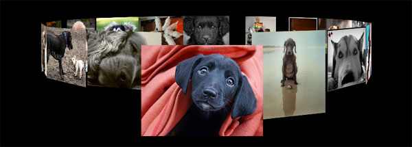
Luckily, since then I have fixed all of those things plus added a couple more improvements. Obviously it is nice that this will work for people with Safari and the page is not as terrible looking, but the most interesting part is the new shapes.
Creating a Slideshow using CSS3 3D Transforms
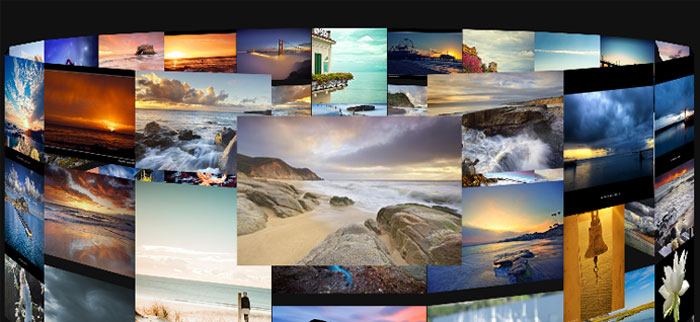
This weekend I was creating a couple fun ideas with Zoomooz.js, an awesome jQuery plugin for zooming to elements on a page, and was bummed to see that it couldn’t handle 3D transforms yet. After seeing Paul Hayes 3D Sphere and the Morphing Power Cubes, I spent a bunch of time playing around with 3D CSS transforms without coming up with anything too practical. But, after some of my Zoomooz experiments, I thought it would be interesting to see if it would be possible to create a scalable 3D slideshow in the model of the Morphing Power Cubes’ ring setup. Unfortunately this only works in webkit browsers because that is the only one that has 3D transform support as of this moment, so I am using Modernizr to test if your browser can preform the 3D Transforms.
Anything you can do, Google does better
Google does a lot of things better than I can. It always knows the best way between two points while I often get lost, it can do unit conversions on the fly while I’m stuck looking for the other side of the measuring cup, and of course it can find pretty much anything as long as you know how to ask. One of the last things I have going for me is the ability to see and process information on the fly. Luckily I can sit on the bus, look at a newspaper and figure out this Sudoku puzzle using just my eyes, my brain and a pen. Oh, Google does that better than I do now too? Great.
A Free and Open Internet?
More Capstone News
Yesterday’s Globe had a nice write up about Numbers Empower: http://www.boston.com/business/technology/articles/2010/05/03/app_can_help_fine_tune_your_electricity_usage/
Site redesign and some more posts coming soon.


