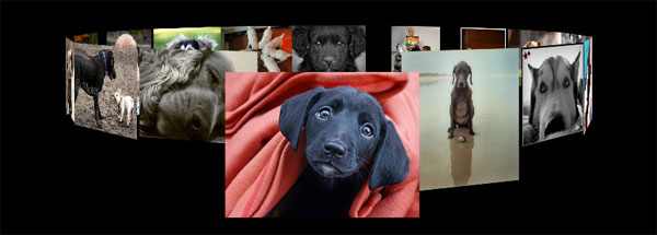
This weekend I was creating a couple fun ideas with Zoomooz.js, an awesome jQuery plugin for zooming to elements on a page, and was bummed to see that it couldn’t handle 3D transforms yet. After seeing Paul Hayes 3D Sphere and the Morphing Power Cubes, I spent a bunch of time playing around with 3D CSS transforms without coming up with anything too practical. But, after some of my Zoomooz experiments, I thought it would be interesting to see if it would be possible to create a scalable 3D slideshow in the model of the Morphing Power Cubes’ ring setup. Unfortunately this only works in webkit browsers because that is the only one that has 3D transform support as of this moment, so I am using Modernizr to test if your browser can preform the 3D Transforms.
So starting with the Power Cube’s ring CSS, I stripped out all of the styles I wasn’t going to need and started creating the JavaScript function that would create the ring dynamically based on how many elements were in the list:
Main CSS:
#container {
	-webkit-perspective: 1000;
	-webkit-perspective-origin: 50% 40%;
	-webkit-transform-style: preserve-3d;
}
#stage {
	width: 100%;
	margin-top: 200px;
	padding-bottom: 100px;
	-webkit-transform-style: preserve-3d;
}
#shape {
	margin: 0 auto;
	height: 240px;
	width: 240px;
	list-style: none;
	-webkit-transform-style: preserve-3d;
	-webkit-transition-duration: 1s;
}
Transform JavaScript:
transform: function () {
    var length = children.length,
        count = length;
    while (count) {
        var child = $(children[length - count]),
			ratio = count / length,
			width = child.width() / 6.3,
			rotate = (length - count) * 360 / length,
			translate = length * width;
        if (rotate > 180) {
			rotate -= 360;
        }
        child
		.css(transformClass + 'transform', 'rotateY( ' + rotate + 'deg ) translateZ(' + translate + 'px)')
		.attr('data-angle', rotate)
		.attr('data-original-angle', rotate)
		.attr('data-translate', translate)
		.addClass(addClass);
        count--;
    }
}
I calculated the angle at which each side should be rotated between -180 and 180 degrees, so that the ring will rotate towards the shortest path on the initial load. Next I estimated the radius of the circle by multiplying the length of the side by the number of sides and divide by approximately 2pi ~= 6.3. I set the angle and translation in the z direction (radius) so that the ring will be created given sides of equal widths. I also saved the original angle, current relative angle, and radius as data attributes for later use.
Now I have the ring and it is looking pretty good, but I want to be able to select pictures and have the ring spin to the selected picture. Instead of changing the angles of the actual sides and rotating that way, it is actually easier to just rotate the outer unordered list element to make it appear that the ring is rotating. Using a jQuery click event handler, I am going to rotate the outer element to the opposite angle of the side I want to see facing forward.
setElementTransform: function (elem, clicked) {
	var	deg = -1 * setup.getElementTransform(clicked),
		value = 'RotateY(' + deg + 'deg)';
	$(elem).css(transformClass + 'transform', value);
}
Next, I needed to recalculate the relative angles for each side so that the ring will always take the shortest path when spinning to the next selected side. So I adjusted the relative angle by +360 or -360 if the difference between the current angle and the slide angle is more than 180 degrees.
setAngles: function (current) {
	var length = children.length,
		currentAngle = parseInt(current.attr('data-angle'), 10),
		count = length;
	while (count) {
		var child = $(children[length - count]),
			rotate = parseInt(child.attr('data-angle'), 10),
			origRotate = parseInt(child.attr('data-original-angle'), 10),
			translate = parseInt(child.attr('data-translate'), 10);
		if (rotate - currentAngle > 180) {
			rotate -= 360;
		} else if (rotate - currentAngle < -180) {
			rotate += 360;
		}
		child
			.css(transformClass + 'transform', 'rotateY( ' + origRotate + 'deg ) translateZ(' + translate + 'px)')
			.attr('data-angle', rotate);
		count--;
	}
}
Last, I changed the translation in the z direction on the selected slide to be 1.6 times normal so that it comes closer to screen and stands out from the rest of the sides. That seems to be about as big as you can make it, without having the picture go past the screen.
I am using the flickr api to get the pictures used for the slideshow. This *should* work for any number of slides (besides 1 I guess), however I think it looks best with less than 50. My browser really starts choking after around 400 slides, but that seems to be pretty impractical anyway.
Again, at this time, 3D transforms only work in webkit browsers, although hopefully they will become more standard soon. In Chrome you may need to update and/or enable ‘GPU Accelerated Compositing’ on the about:flags page for this to work. If it is still not working check the about:gpu for more information. I am currently on Google Chrome 11.0.696.34 beta on Windows 7 and I think it looks pretty awesome, so hopefully it does for you too. My girlfriend was not as thrilled about it as I was until I changed the search term to be puppies; now she loves it.
Take a look at the finished demo or get the source on github

Pingback: Slideshow with CSS 3D Transforms Part 2: Playing with Shapes | Marc Neuwirth's Blog
Pingback: Linkdump #36: CSS3. « Tomasz Kowalczyk