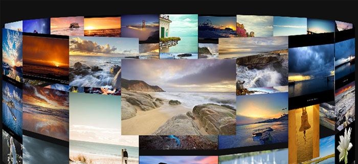
So there were a couple of issues in Part 1:
1) I was using ‘class’ as an element in the options object and threw an error in Safari.
2) The rest of the page besides the gallery looked really uninteresting.
3) A ring is the only shape that we could make.
Luckily, since then I have fixed all of those things plus added a couple more improvements. Obviously it is nice that this will work for people with Safari and the page is not as terrible looking, but the most interesting part is the new shapes.
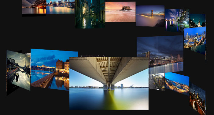
While a ring was cool, I figured that now that we had the framework for generating a 3d slideshow gallery, it should be pretty simple to extend this to include a bunch of different shapes: Vertical, Cylinder, Ribbon, Double Helix, Coil and, of course, Ring.
I was able to create these 8 different shapes using 4 parameters. Flat controls whether each slide will be a different height or even with its neighbors. Vertical controls if the rotation is on the x-axis or y-axis. Rows creates multiple smaller circles based on the number. Helix controls how many streams there are. So the default ring woud be flat, 1 row, 1 helix and not vertical.
getShape: function (type) {
    switch (type) {
    case 'Vertical':
        return {
            flat: true,
            rows: 1,
            helix: 1,
            vertical: true
        };
    case 'Cylinder':
        return {
            flat: true,
            rows: 3,
            helix: 1,
            vertical: false
        };
    case 'Tall Cylinder':
        return {
            flat: true,
            rows: 6,
            helix: 1,
            vertical: false
        };
    case 'Ribbon':
        return {
            flat: false,
            rows: 2,
            helix: 1,
            vertical: false
        };
    case 'Double Helix':
        return {
            flat: false,
            rows: 1,
            helix: 2,
            vertical: false
        };
    case 'Coil':
        return {
            flat: false,
            rows: 2,
            helix: 0,
            vertical: false
        };
    case 'Big Coil':
        return {
            flat: false,
            rows: 1,
            helix: 0,
            vertical: false
        };
    case 'Ring':
        return {
            flat: true,
            row: 1,
            helix: 1,
            vertical: false
        };
    default:
        return {};
    }
}
For each of those settings, some work is happening in the transform function to change the rotation value or the amount the picture is translated in either the Z or Y direction:
var rotate = ((length / rows) - count) * 360 / (length / rows),
    translateZ = length / rows * width,
    translateY = 0;
if (!flat) {
    if (helix > 1) {
        translateY = count % helix * 2;
        translateZ /= 2;
    } else {
        translateY = count / 4;
    }
} else {
    if (rows > 1) {
        translateY = parseInt((count - 1) / (length / rows), 10) * 1.5;
    }
}
translateY *= height;
rotate = rotate % 360;
if (rotate > 180) {
    rotate -= 360;
}
Go over to the demo page and try out some of the different shapes with different numbers of pictures. It is interesting to see which handle many pictures really well. The Double Helix, Ring and Vertical are pretty unwieldy at around 100 pictures, but look cool with fewer. The Cylinder looks ok with less than 30 pictures, but I think it really shines with more. Try the Cylinder or Tall Cylinder with 120+ pictures and it looks awesome, everything is still easy to see and navigate. I like the Coil and Big Coil also, they look pretty good no matter how many pictures, but they take up a ton of room for the amount of pictures they show at one time. Ribbon isn’t all that exciting, but it looks nice enough and it doesn’t take up too much room.
One nice little addition I added in was the left and right arrow keys should now function to move you through the photos as you would expect. This makes navigation a little bit easier and is also a nice way to move through some of these new shapes in a way that wasn’t really necessary with just the Ring.
Make sure you take a look at the finished demo (or the original demo) and get the source on github. Which shapes do you like the best?
Enabling 3d transforms in Chrome:
Type in about:flags in your address bar, enable GPU Accelerated Compositing and restart your browser.
If it is still not working, navigate to about:gpu. It appears that this won’t work on some Windows XP machines saying: “Hardware Acceleration Unavailable NVIDIA drivers older than 257.21 on Windows XP are assumed to be buggy”


Pingback: Creating a Slideshow using CSS3 3D Transforms | Marc Neuwirth's Blog
Pingback: Building the Prudential Tower in CSS | Marc Neuwirth's Blog